🏠 Real Estate House Sales - Tableau Dashboard
Real Estate House Sales Dashboard (Tableau)
Project Overview
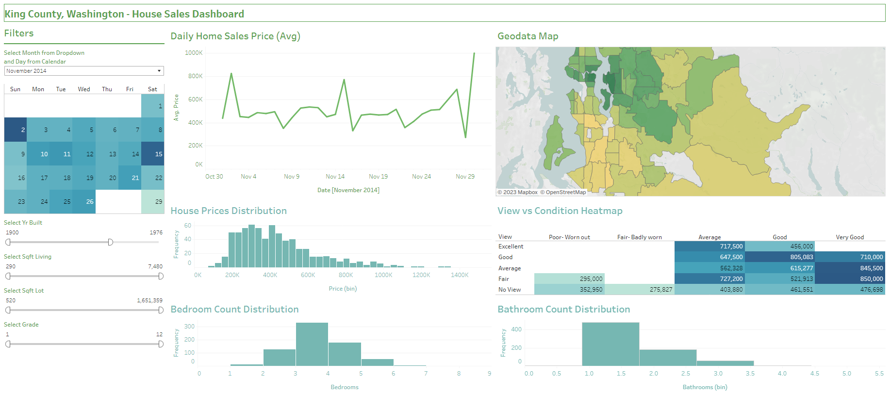
- The dashboard represents House Sales for King County, Washington and contains data on house details (sqft, floors, rooms, yrs), prices conditions and geodata (latitude/longitude, zipcode).
- 6 visualizations were created,
- Daily House Sales Price (Line Chart)
- House Price Distribution (Bar Plot)
- Bedroom Count Distribution (Bar Plot)
- Bathroom Count Distribution (Bar Plot)
- View vs Condition (Heatmap)
- Geodata Map
- This is paired with interactive filters on:
- Date
- Year Built
- Square foot Lot and Living
- House Grade
- This project is mostly based on familiarizing myself with the functions of tableau, however, it can be very helpful for buyers, and real estate sellers to have an overview of prices to expect depending on the property.
- Viewers are able to see the prices of houses based on the year, size, rooms and location to get an idea of how to price their lots, or what prices to expect when purchasing properties.
- Finally huge credits goes to “Data With Mo” youtube channel for providing these and additional resources teaching Data Analytics. Despite the hands-on guide, I added additional functionality and edits (such as the map filter).
Please access the full Tableau Dashboard here LINK.
You can access the data used in XLSX format here LINK.
Objectives
- Create a dashboard that visualize changes in Home Sales Price by time, in relation to its traits (bedroom/bathroom count, year built, size) and locations.
- Provide an overview of distribution of prices and rooms.
- Visualize the condition and view of houses with its corresponding prices.
- Create interactive filters for house buyers and sellers to know more about average house prices in accordance to their needs.
Project Process
Project Context
- This project was specifically undertaken to fill in gaps in my knowledge of creating visuals after completing the Google Advanced Data Analytics Certificate.
- Although the mentioned program went in depth in creating visualizations, I still felt the need to take more projects to familiarize myself further with tableau, as I have already done a dashboard in excel (see my excel dashboard here).
- Although made in Tableau, I am also currently taking a PowerBi course (Story Telling with PowerBi - Coursera) and will update this portfolio website when more time is available.
Steps Taken
Expand for full tableau creation process:
1. Loading of Data Set, Validating Data, Formatting
- Data set was loaded in tableau. Fortunately, this dataset has already been cleaned and validated. This is a rarely the case in actual scenarios, but this is okay as the goal of this project is to learn tableau
- Data types had to be properly validated/set each time they were dragged to columns and rows for the visuals.
- Proper formatting had to be applied for each visual: font, colors, titles, lines and visualizations had to be uniformed.
2. Creation of Visuals
- Visual 1 - Avg House Sales Price Line Chart: data types had to be validated and formatted.
- Visual 2 - GeoData Map: proper country and zipcode had to be identified. Map was formatted for visibility.
- Visual 3 - Distribution of House Prices: Proper identification of data types and formatting was applied. Tooltip fixed.
- Visual 4 - Distribution of Bedrooms: formatting pasted from previous visuals. Renaming title and sheet.
- Visual 5 - Distribution of Bathrooms: formatting was pasted and adjusting of content. Tooltip corrected.
- Visual 6 - View vs Condition Heatmap: Dragging and reorganizing of variables, sorting fixed manually. Dragged price to color and labels. Formatted titles and visuals again.
3. Creation of Filters
- Create calendar filter: drag calendar to col (weekday), rows (week) and filters (month/year). Drag price to color (avg), date to label (day) and format colors and columns.
- Year filter: drag year to filters, show filter.
- Sqft living/lot filter: drag sqft living/lot to filters, show filter.
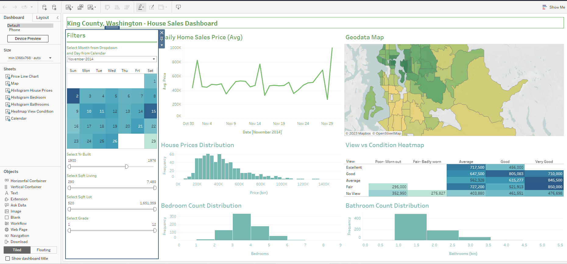
4. Build the dashboard
- Fixing sizing, set minimum to generic desktop size, uncheck maximum.
- Drag necessary items: containers, text, object, filters, and rename titles.
- Drag all visualizations and finalize formatting.
5. Filter functionality
- The dashboard can be seen in the first sheet, while the second sheet contains instructions, input cells and calculations for the dashboard.
- For future references and projects, this calculation sheet design can and should be improved. However, only the main visual was the focus during the task.
- Applied filter by clicking:
- More options > apply to worksheets > selected worksheets (select all).
- Dashboard > actions > Filter > edit > untick map and line chart.
- Do the same for the map to make it a filter.
- Do the same for Yr, Sqft Loft and Sqft Living filters.
6. Final Check and Publishing
- Final check up and formatting of text, numbers and relevant data.
- Test sliders and filters.
- The dashboard are saved and published via Tableau Public.
Conclusions and Recommendations
Insight
- From May 2014 - 2015 (entire dataset), the highest distribution of houses had the following attributes:
- Average Price of USD 500K
- Average to Good Condition paired with Good to Excellent View
- 3-4 Bedrooms and 1-2 Bathrooms
Prices indicators:
- Sqft living is the one of the highest indicators going beyond USD 1,000K when looking at the top half of largest sqft living.
- “Grade” is also one of the highest indicators.
- Grades 1-7 costs sits mostly USD 250K
- At Grades 8 - 12, prices drastically jump to at average of USD 500-600K
Recommendations for House Shopping
- For price sensitive buyers with budget around USD 250K, look at houses with grades from 1-7.
- For those that want improved houses, it may be worth looking at lower grade houses and investing in renovation instead.
- To make the most out of 300K budget, one can look at houses built recently at 2000, and even look at grades 7-12. This seems to be the sweet spot for maximizing budget to house condition.
- Despite the recommendations, shopping or selling for a house has lots of factors to account for, however, the dashboard is still able to give us an idea of appropriate pricings based on location.
Improving the Project
- Although the main purpose of this project to practice tableau was met, the following can be done to better the project:
- Use more recent dates, or an API to gather up-to-date prices of homes.
- For buyers and sellers, having a price filter will also be useful.
- If data is available, additional attributes about the house can also be visualized.
- With feature engineering, one can make a score rating of the amount of nearby establishments (schools, stores, offices) in relation to distance. This gives us a score for the locations which is especially beneficial for buyers and developers.
More thought on improving the visual can be put, however, this one retains good visibility and clarity.
- Again you may access the full Tableau Dashboard here LINK.
Thank you for your time viewing!
This post is licensed under CC BY 4.0 by the author.

