🐧 Identifying Penguin species through K-means clustering
Project Overview
- In most datasets, we do not realistically know how to effectively group or classify our data yet (customer segments, products etc.) or have labeled data already.
- When this happens, we can use unsupervised machine learning techniques to classify our data based on commonalities.
- Using a K-means model, we were able to automate classifying penguins by its species and genders purely based on their measurements (bill length, bill depth, flipper length body mass and gender).
- The K-means model was highly successful in classifying penguins showing us the application of clustering in employee education and projects.
You can access the IPYNB file for more details here LINK
Objectives
- Create a model to find patterns within penguins to allow the zoo’s care taker team to find patterns to learn more about the penguins specie to give them the proper care and environment needed.
- For data preparation: check for missing values, encode data, dropping of columns and scale features to fit our model.
- After, create an unsupervised machine learning classification model and identify the most optimal number of clusters or groupings for penguins.
- Finally, give recommendations and practical applications for the team based on our findings.
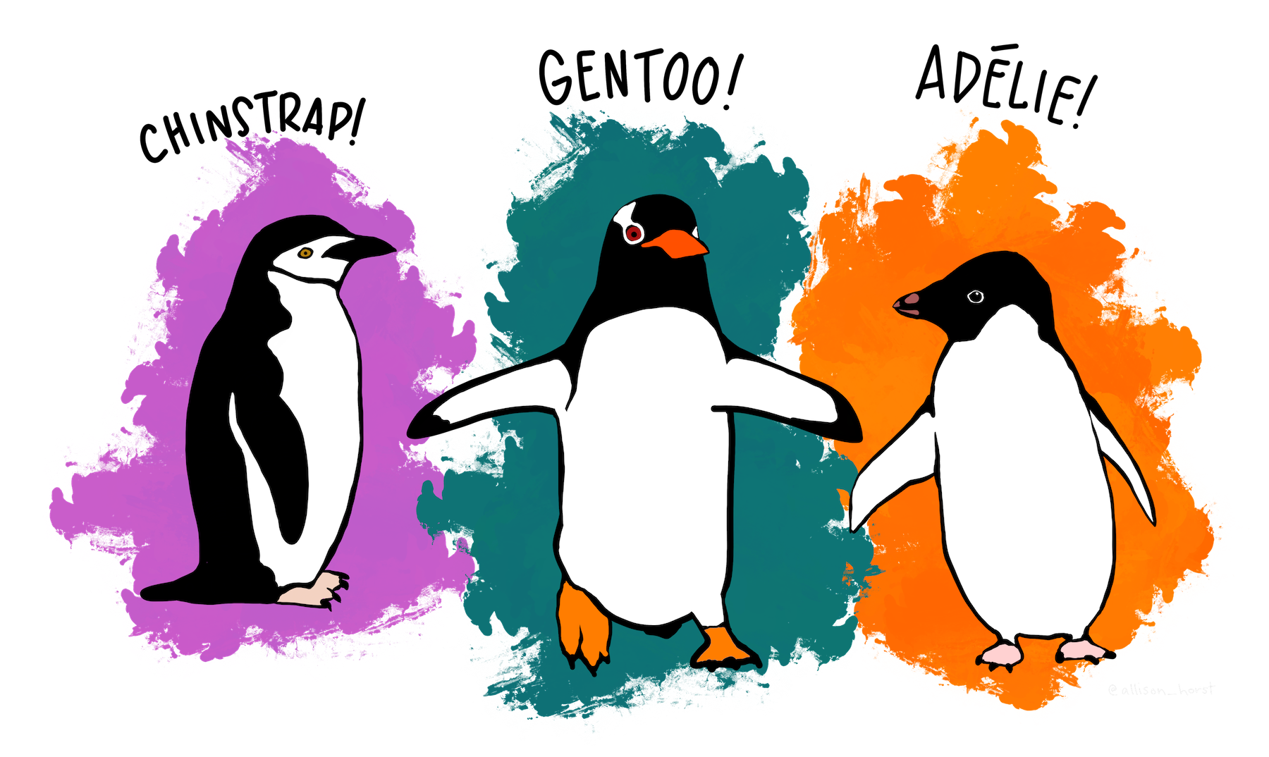
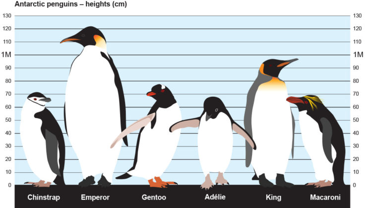 Image from British Antarctic Survey: bas.ac.uk/about/antarctica/wildlife/penguins/
Project Process
Project Context
- The data set contains a sample size of 345 penguins, classified by species, island, gender, bill and flipper length and depth.
- This project was created to focus on the construction of a K-means model rather than in-depth EDA.
- For a project with more in-depth EDA process, visit my Human Resource portfolio here: LINK
- As a refresher: a K-means model is an unsupervised partitioning algorithm used to organize unlabeled data into groups or clusters. This creates a logical scheme to make sense of data, grouping the data in clusters around central points (or centroids).
Steps Taken
1. Imports, Data Exploration, Data Encoding and Scaling
- Again this will be a short summary of steps taken for the project. You can access the full breakdown and process here: LINK
Importing Libraries
- Let import the following packages for this project:
1
2
3
4
5
6
7
8
9
10
11
12
# Import standard operational packages.
import numpy as np
import pandas as pd

# Important tools for modeling and evaluation.
from sklearn.cluster import KMeans
from sklearn.metrics import silhouette_score
from sklearn.preprocessing import StandardScaler

# Import visualization packages.
import matplotlib.pyplot as plt
import seaborn as sns
For our dataset, we can import it directly from seaborn using this code block.
1
penguins = sns.load_dataset("penguins")
Data Exploration
- We use the
.head(), .unique(), .value_counts()for our initial exploration. We learn that we have 152 Adelies, 124 Gentoos and 68 Chinstraps. This gives us additional insight on our desired groupings at the end of the project.
- K-means also assumes that there are no missing values. We can check this using
penguins.isnull().sum()showing us we have some missing values on some data. - We can drop missing values using the
penguins.dropna(axis=0).reset_index(drop=True)function.
Data Encoding and Scaling
- Within the
sexcolumn, some are written as Male/Female instead of MALE/FEMALE. - For consistency, we can transform all to upper case letters using the
str.upper()function. - For K-means, we also require the columns to be numeric. We convert
sexto numeric using the.get_dummies()function like so:
1
2
# Convert `sex` column from categorical to numeric.
penguins_subset = pd.get_dummies(penguins_subset, drop_first = True, columns = ['sex'])
Finally, since K-means uses distance as a measure of similarity between observations, we have to scale the data using the
StandardScalerfunction. This makes it such that all variables have a mean of 0 and a standard deviation of 1.- We drop the species column as we will not be using it in training the dataset.
- Our data is scales using the following code block:
1
2
#Assign the scaled data to variable `X_scaled`.
X_scaled = StandardScaler().fit_transform(X)
2. Data Modeling
Inertia Plot
- Going into modeling, we have yet to know how many clusters (k) to use.
- To approach this, we may fit the K-means model and evaluating inertia for different values of k.
- Let us start by creating a function
kmeans_inertiataking in clusters (k) and our scaled values. This returns a list of each k-value’s interia. - We can then plot this to determine the most optimal clusters.
1
2
3
4
5
6
7
8
9
10
11
12
13
14
# Fit K-means and evaluate inertia for different values of k.
num_clusters = [i for i in range(2,11)]

def kmeans_inertia(num_clusters, x_vals):
    inertia = []
    for num in num_clusters:
        kms = KMeans(n_clusters=num, random_state=42)
        kms.fit(x_vals)
        inertia.append(kms.inertia_)
    return inertia

# Return a list of inertia for k=2 to 10.
inertia = kmeans_inertia(num_clusters, X_scaled)
inertia
Here is a plot of the results to visualize the most optimal inertia. 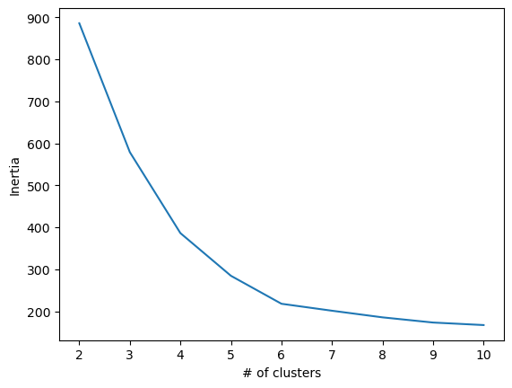
In the plot, there is an elbow at point 6, where additional clusters contribute very little changes. We can check silhouette scores to confirm this.
Silhouette Score Plot
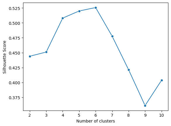
- Start by using the sil_score() function to study the distance between clusters 2-10.
- Followed by this, create a function kmeans_sil taking in clusters (k) and our scaled x_vals again to return a list of each k’s silhouette score.
1
2
3
4
5
6
7
8
9
10
11
12
13
14
# Evaluate silhouette score.
# Write a function to return a list of each k-value's score.
def kmeans_sil(num_clusters, x_vals):
    sil_score = []

    for num in num_clusters:
        kms = KMeans(n_clusters=num, random_state=42)
        kms.fit(x_vals)
        sil_score.append(silhouette_score(x_vals, kms.labels_))

    return sil_score

sil_score = kmeans_sil(num_clusters, X_scaled)
sil_score
Again we can plot these values to show the relationship between number of clusters and silhouette score.
To interpreting the plot:
- Closet to 1 is the most ideal: telling us that samples are in its own clusters
- 0 means that samples are near boundaries between clusters
- -1 tells us that samples may be in the wrong clusters
In our case, 6 is our ideal value being closest to 1.
3. Model Evaluation and Visualization
Optimal k-value
- From the previous information, we can fit a six-cluster model to the dataset.
- Next, let’s create a new column adding our cluster labels.
- By doing this, our rows are now assigned to each of its own clusters.
1
2
# adds a new column containing their assigned cluster
penguins_subset['cluster'] = kmeans6.labels_
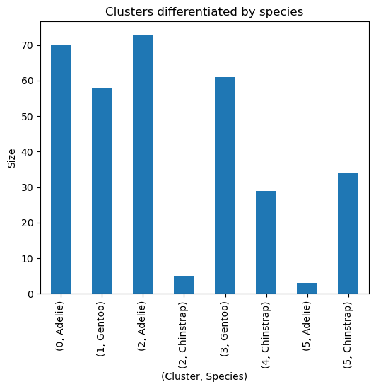
- To verify if they can be differentiated by species, let’s use a groupby function.
1
2
# Verify if `cluster` can be differentiated by `species`.
penguins_subset.groupby(by=['cluster','species']).size()
| Cluster | Species | Count |
|---|---|---|
| 0 | Adelie | 70 |
| 1 | Gentoo | 58 |
| 2 | Adelie | 73 |
| 2 | Chinstrap | 5 |
| 3 | Gentoo | 61 |
| 4 | Chinstrap | 29 |
| 5 | Adelie | 3 |
| 5 | Chinstrap | 34 |
Likewise, we can utilize a plot to better visualize these.
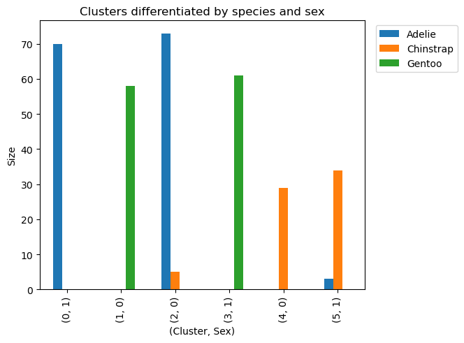
Additionally, we can use another groupby to see if the penguins are sorted by gender to make more sense of our data.
1
2
# Verify if each `cluster` can be differentiated by `species' and `sex_MALE`.
penguins_subset.groupby(by=['cluster','species','sex_MALE']).size().sort_values(ascending=False)
| Cluster | Species | sex_MALE | Count |
|---|---|---|---|
| 2 | Adelie | 0 | 73 |
| 0 | Adelie | 1 | 70 |
| 3 | Gentoo | 1 | 61 |
| 1 | Gentoo | 0 | 58 |
| 5 | Chinstrap | 1 | 34 |
| 4 | Chinstrap | 0 | 29 |
| 2 | Chinstrap | 0 | 5 |
| 5 | Adelie | 1 | 3 |
It can be observed that our model has classified penguins both by species and gender. In addition, it only had 8 wrong classifications (3 adelie and 5 chinstrap).
This last visualization shows us how our model classified our data being by species and sex. We can also visualize the small amount of wrongly classified penguins.
Conclusions and Recommendations
 Image uploaded by Osamu Mustafa: researchgate.net/figure/On-site-images-of-gentoo-P-papua-chinstrap-P-antarctica-and-Adelie-P-adeliae_fig20_318281059
Above are on site images of gentoo (P. papua), chinstrap (P. antarctica) and Adélie (P. adeliae) penguins, each adults with chicks.
Insight
- Adelie had the highest amount of species followed by gentoo then chinstrap.
- In the errors, Adelie and Chinstrap females were mixed showing us that they may have more identical traits to each other as compared to gentoo.
- Within data science projects, most work are related to preparation (cleaning, encoding, transforming and scaling).
- Inertia and silhouette scores are very effective when used together to determine optimal clusters.
- Natural groupings was found in the data through our model.
- Finally, the groupings into 6 made sense there being 3 species x 2 different genders since different genders and species will have different length, bill depth, flipper length and body mass.
Improving the Project
- Being an unsupervised model, we do not have access to feature importances. Other types of models can then be explored if you need feature importances. Despite this, it is not as important for our project with the main goal only being to classify penguins.
- Although not directly related to this project, aside from classifying by measurements, the company can look into using image classification if it does not have measurements on the penguin.
- Despite this suggestion, our model is very practical since penguins may tend to look alike on certain angles.
- Additionally we can use further data on their weight and genders in many other applications such as changing the amount of food for each weight class or having a better understanding of the health and changes of the penguins over time.
