📈 Banking App Enrollment Campaign - Excel Dashboard
Enrollment Campaign for Banking App Registration
Project Overview
- A bank is launching a new campaign aimed to encourage current clients to enroll in their new mobile application.
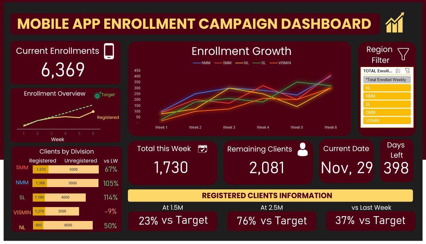
- The country is divided into 5 regions. Performance for each region can be filtered using slicer function in excel.
- A line graph, stacked bar chart and highlights of key values were used to represent key factors.
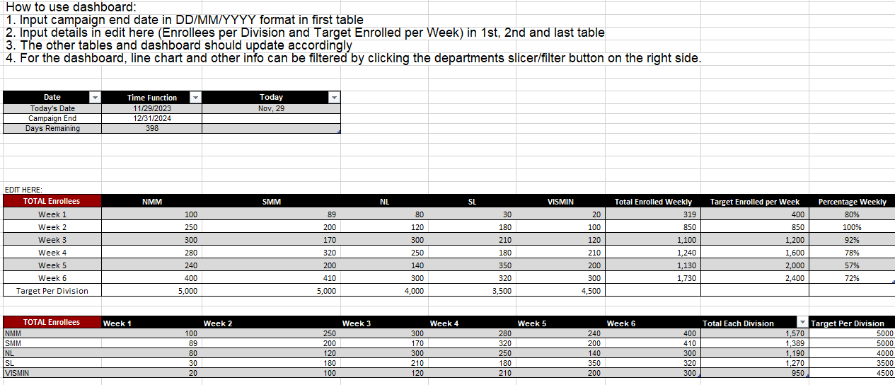
- Data are inputted to a different sheet and values automatically update in the dashboard.
You can access the EXCEL file here LINK
Objectives
- Visualize overall enrollment and performance for each region.
- Compare registered and unregistered clients for each region.
- Give information on campaign health via:
- Current Enrollments vs Target
- Total this Week and Remaining Clients
- Days Left
- Registered Clients (at 2.5M, at 2.5M and vs last week)
Project Process
Project Context
- This dashboard was given to me as a task for one of my internships, however, at that time I was still learning data visualization.
- The task was to create a dashboard to track performance for the new mobile app enrollment campaign.
- Due to data privacy, I was not provided with data, only examples from previous dashboards.
Steps Taken
1. Gathering of Relevant information
- Available resources, tasks, references and relevant data was gathered in this step.
- One of the most important resources I had was the reference to old dashboards due to the lack of data access as interns.
2. Communication with relevant stakeholders
- Despite the limited data access, my mentor at that time tasked me to create a format for the dashboard. I volunteered creating it via excel, including a backend sheet that automatically updates the dashboard based on values inputted.
3. Creation of Data and Dashboard
- Creating dummy data while considering if it can represent actual values was an important skill set in this case, as I had to understand how each value affects the overall data and visualization.
- The dashboard can be seen in the first sheet, while the second sheet contains instructions, input cells and calculations for the dashboard.
- For future references and projects, this calculation sheet design can and should be improved. However, only the main visual was the focus during the task.
4. Dashboard and Visual Designs
Visual 1
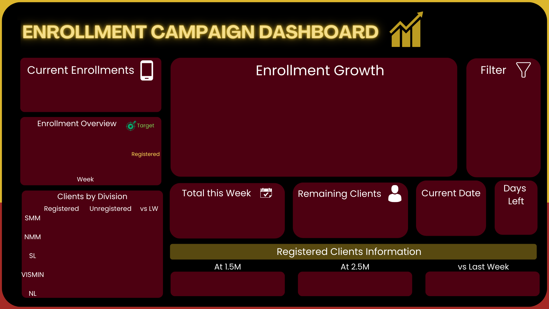
- The design and layout of the dashboard was created using canva. There were several drafts and iterations throughout designing but it was important to stick to the branding colors and visuals.
- This was the visual used for the output with the logo removed.
Visual 2
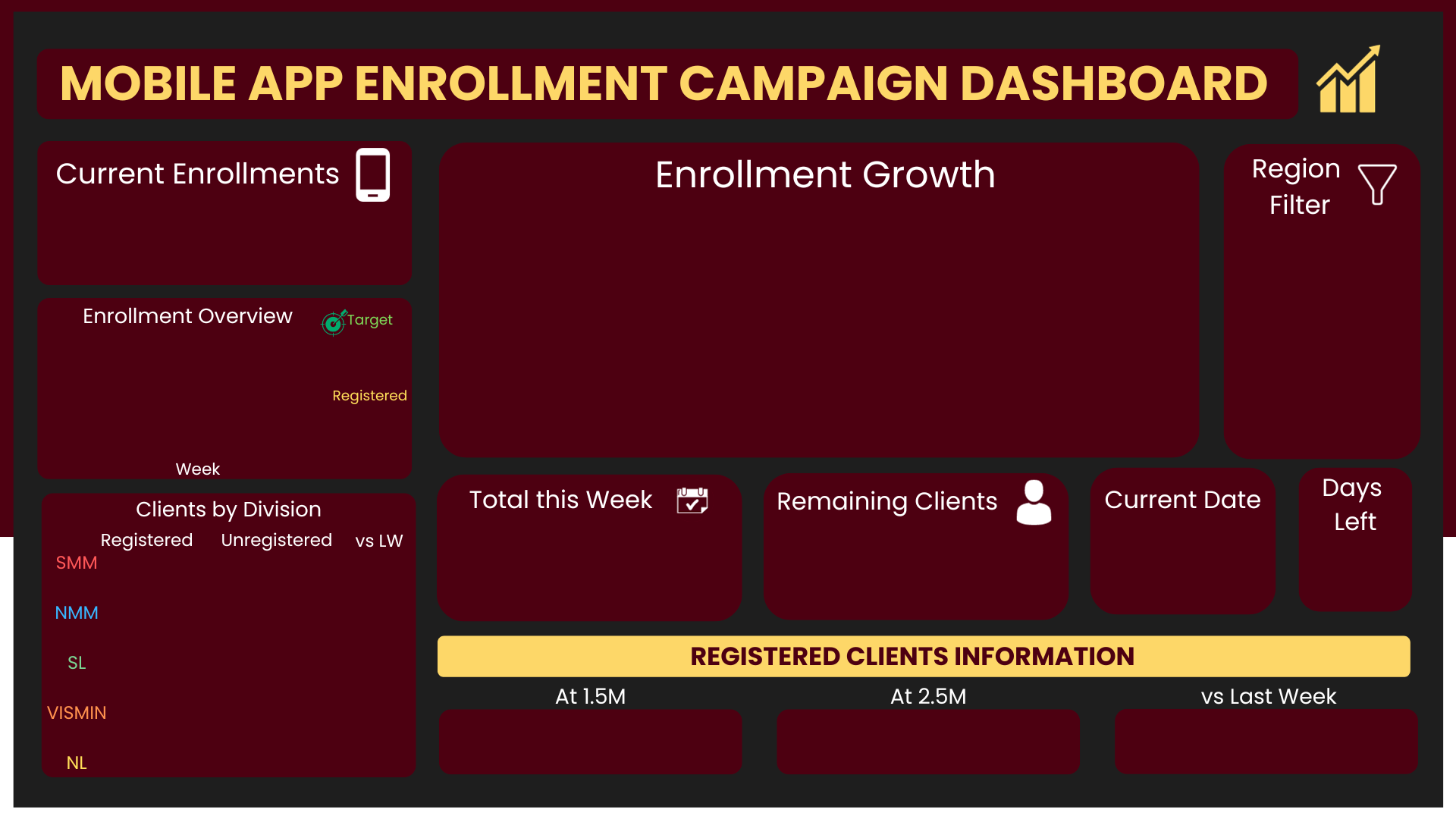
- For the sake of the portfolio, I did slight edits of how I would approach the design. Despite this, I have kept the same functionality and visualizations.
- The uploaded excel file will be using this visual.
Conclusions and Recommendations
Insight
- Although this visual used synthetic data, here are insights that can be gathered from the campaign:
- The current registrations has kept up with the target registrations at the start but slowed down overtime.
- South Metro Manila (SMM), North Metro Manila (NMM) and Visayas Mindanao (VISMIN) have the highest amount of registrations respectively whereas South Luzon (SL) has the highest growth versus last week.
- All 5 divisions are growing at a steady rate. Performance dipped on week 5 for all divisions - in contrast to SL with a performance increase.
- It is worth investigating what SL did during week 5 to increase registrations.
- At 1.5Mn registrations, the number of clients registered was only 23% of the target set.
- Performance improved and at 2.5Mn registrations, registered clients reached 76% of the target.
- Although interpretation on this has to be clarified, compared to last week, current registration are still low only hitting 37% of the target registration.
Improving the Project
- For future purposes, it will be ideal to link values from an SQL database to a visualization application such as Tableau or PowerBI.
- However, if stakeholders or future users are more familiar with excel, excel is still very much a good option.
- The visual was inspired by ‘dark mode’, but in terms of accessibility, brighter takes will be easier to see.
- If data was present, more filters/slicers to visualize results by date will be a great addition.
- Feature engineering may also be also be applied to come up with new columns and further visualizations.
Thank you for your time reading!
This post is licensed under CC BY 4.0 by the author.


