📊 Data Professionals Survey Breakdown - PowerBI Breakdown/Dashboard
 Image Source: data.org/guides/building-a-data-team/
Project Overview
- Alex has conducted a survey of over 600 participants to data professionals all over the world. With the raw data coming from the survey, he tasks a data analyst to create their own visualizations and breakdown of the responses.
- Through PowerBI, a breakdown in a form of a dashboard was created to help visualize survey responses.
- Initial data was prepared through Power Query before visuals were created into PowerBI Desktop.
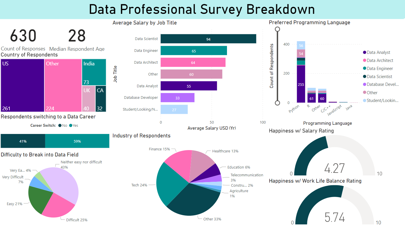
- Responses such as average salary by job title, preferred programming language, industry of respondents, and ratings on worklife balance are just a few of the responses visualized in the final output.
- Huge credits goes to Alex the Analyst for conducting the survey, making it available and providing many resources on data analysis.
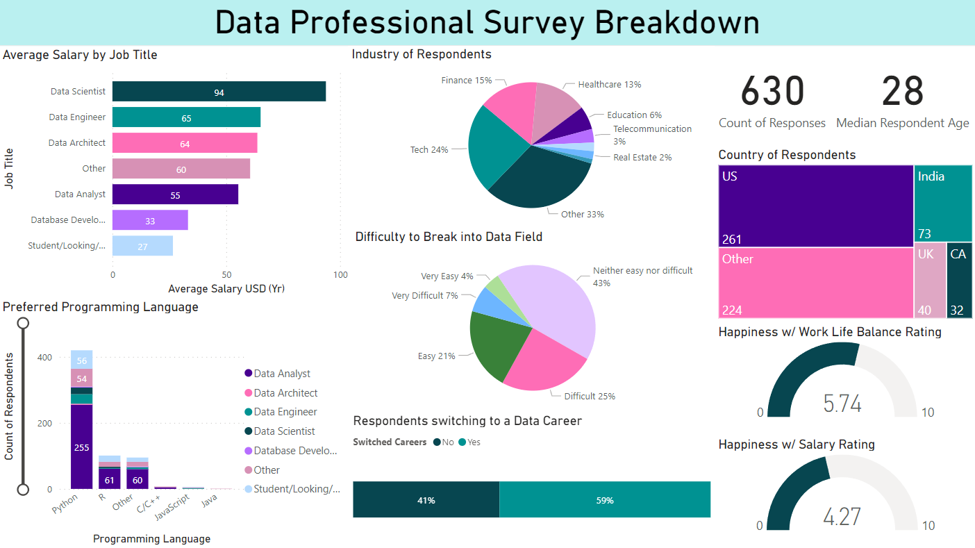
Here is a preview of the prepared breakdown:
You can access the PBIX file created for the project here: LINK
You may also access the dataset used here: LINK
Objectives
- Create a breakdown and analysis of survey responses taken data professionals.
- For data preparation: converted relevant values to numeric values, and apply needed transformations for our visuals.
- Formulate and experiment various data visualizations from the available data.
- Fix formatting, coloring, labels and visuals for presentation of dashboard analysis
 Image Source: koenig-solutions.com/blog/beginners-guide-for-learning-microsoft-power-bi
Project Process
Project Context
- The data set contains survey respondents taken from various Data Professionals (Analysts, Scientists, Engineers etc.) throughout different countries. Data contains information oon salary, satisfaction, preferred programming language, career shifting (and its difficulty) and many more relevant information.
- This project focuses more on data visualization and presentation through PowerBI as compared to through data cleaning and preparation. For more data cleaning and preparation related content, kindly check out my other portfolio projects.
- Once again, huge credits to Alex the Analyst (YouTube Channel) who created a guide for this project, despite this - personal changes, additional visuals, design changes and measurements were added as I explored PowerBI and its capabilities.
Steps Taken
1. Imports, Data Transformation and Preparation
- Data was imported to PowerBI from an xlsx file and was explored through Power Query.
- For roles, “other” jobs listed were removed through the use of split column by delimiter, and replace values.
- For salaries, the number ranges were split into two and averaged. Ex. for 66 - 85k, 66 and 85 was split into different columns and averaged. The dash and k were removed using replace values. For max value 225, this was kept. Values were changed from text to numeric.
- For countries and industries, “other” options were removed as well.
2. Dashboard Analysis Making
- Creation of Title and Banner
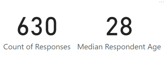
- Cards were created for the amount of respondents and median age to avoid massive massive changes due to outliers.
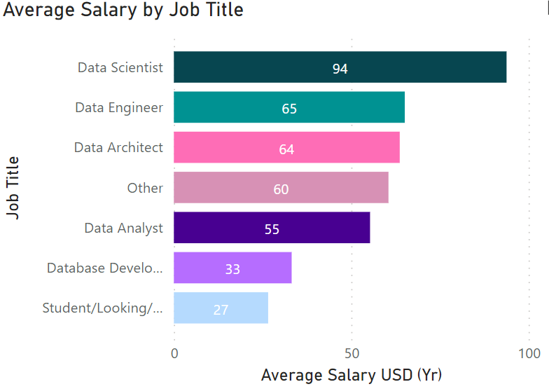
- A stacked bar chart containing the Average Salary by Job Title was made. Proper titling, formatting and labels were added for each visual. Job Title Labels were removed also due to clutter while numbers were added inside bars.
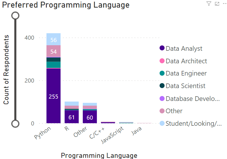
- Favorite Programming Langues were visualized along with respondent count and roles through a stacked column chart.
- A slider was added to help give a closer look for smaller amounts.
- Job title was also repositioned to the right side to allow for more space.
- The next visualization initially compared Average Salary by Sex, however, both male and female had very similar salaries with female having slightly higher. This was then replaced to give more room for other visualizations.
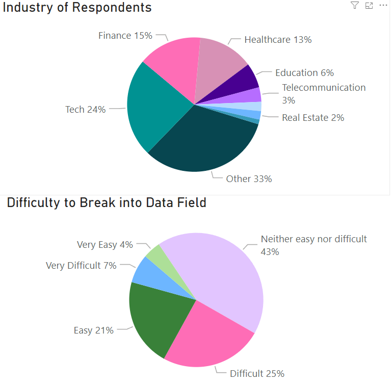
- Industry of Respondents ideally is shown through a TreeMap, however labels are no longer shown properly. A Pie Chart was shown instead since is a comparison of divisions from the whole set of respondents.
- Difficulty to Break into data field was approached similarly.
- Pie Charts had to be rotated also to give space for labels.
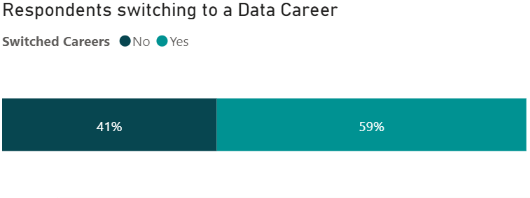
- Originally, this was also a pie chart, however, it took too much space and spaces were visually similar.
- A stacked bar chart was then utilized with labels for x and y axis removed. Instead, percentages were included within the bars.
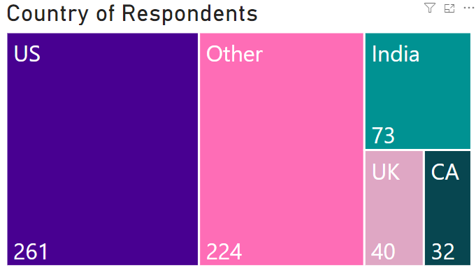
- In many cases, a tree map is more effective in visualizing spaces as compared to a pie chart.
- Unfortunately Labels do not fit each space, to fix, I transformed data once again to replace United Kingdom to ‘UK’ and Canada to ‘CA’.
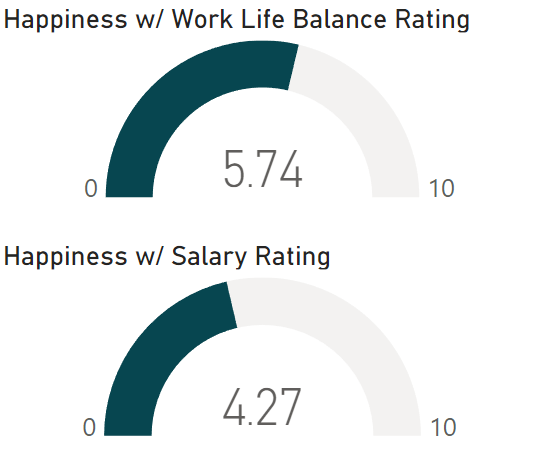
- Finally, although gauges are rarely utilized, this was a great opportunity to use this visual as it is able to represent a scale well. Initially, a third gauge was added regarding “upward mobility”, this was removed to reduce cluttered. It also only had an average score.
3. Assembly of Visuals
Final Visual
- Lots of time was put into planning the visuals and colors scheme. Ultimately this scheme was settled on, since, not only was it visually pleasing and worked well with light mode, it was also more accessible for colorblindness (tritanopia).
- Overall, visuals were positioned to maximize visibility, uniformity of plot types and visual appeal.
Approach 2
- Another approach would be to tell a story or details from left to right, top to bottom like reading a book.
- In this Approach: Count of Respondents, Country and Career switch was first introduced to the left, introducing the overall survey.
- 2nd, Average Salary and industry are positioned in the middle.
- Finally, preferred language and salary are put in the right most.
- This approach tells more of a story regarding the survey content.
- Overall, approaches can be organized in many ways depending on personal preference and flavor.
Conclusions and Recommendations
Output Observations and Insight
- To start there are a total of 630 responses, majority from the United States (261), followed by other countries (224). The median age was 28.
- Data Scientists are paid the most almost double of Data Analyst. This was followed up by Data Engineer and Data Architect in that order.
- Python is massively preferred by most data professionals, followed by R and other. From the dataset, the other options mostly contain SQL.
- Surprisingly, 59% shifted into the Data Career field. This may be due to massive factors, including being a relatively new and emerging field.
- Majority of survey respondents came from other industries, followed by tech, finance and healthcare.
- Almost half found transitioning in the Data field neither difficult nor easy. The rest found it difficult (25%) followed by easy (21%)
- Finally, Happiness w/ Salary rating was less than average (4.3/10) and Happiness w/ Work Life Balance was slightly above average (5.7/10).
Improving the Project
- Since the focus of the project was more on building the project, more focus can be given into cleaning the datasets. Instead of grouping countries by “other”, more time can be taken to properly transform countries w/ high counts.
- This can also be said with Industry and other types of data.
- In exchange for clarity, more graphics and visuals can also be added or experimented with.
- Although the entire graphic is interactive, filters can also be utilized.
- Feature Engineering can also be preformed to come up with new columns and measures to visualize.
Thank you for your time reading!
This post is licensed under CC BY 4.0 by the author.
